I wanted to understand how weather affects HVAC demand across Ontario, so I built a full dataset and analysis that connects real climate patterns to real service needs. I wanted this to be something investors and operators could actually use when thinking about where demand is strong, where it is growing, and where new branches or acquisitions might make sense. Instead of relying on general beliefs like “the north is cold” or “the south has hot summers,” this project shows what each region actually experiences throughout the year.
Building the Dataset
I started by collecting daily weather records from more than 170 Environment Canada (http://climate.weather.gc.ca) stations across the province. Each station tracks temperature, precipitation, wind, and other climate details. I uploaded all the raw CSV files to Google Cloud and used BigQuery and SQL to clean, standardize, and combine everything (also Python - Pandas). This meant fixing date formats, removing bad entries, lining up columns, and building one clean and unified table.
After the cleanup, I created the key climate indicators that HVAC teams often look at: Heating Degree Days, Cooling Degree Days, and counts of extreme heat or cold days. These give a clearer view of how much heating or cooling a region needs over time.
Creating the Expansion Score
To compare regions more easily, I created a combined metric called the Expansion Score. It takes heating demand, cooling demand, and temperature swings and turns them into one number. It is not an official industry metric, but it works well as a simple way to compare markets.
Areas with large heating or cooling needs tend to place more pressure on HVAC systems. This usually means more service calls, more recurring maintenance, and higher demand for technicians. With the Expansion Score, I could line up all 170 stations and quickly see which places would support year-round HVAC demand and which ones would be more seasonal.
Visualizing Ontario’s HVAC Patterns
To make the findings easier to understand, I used Tableau to build several visuals that show the climate patterns clearly.
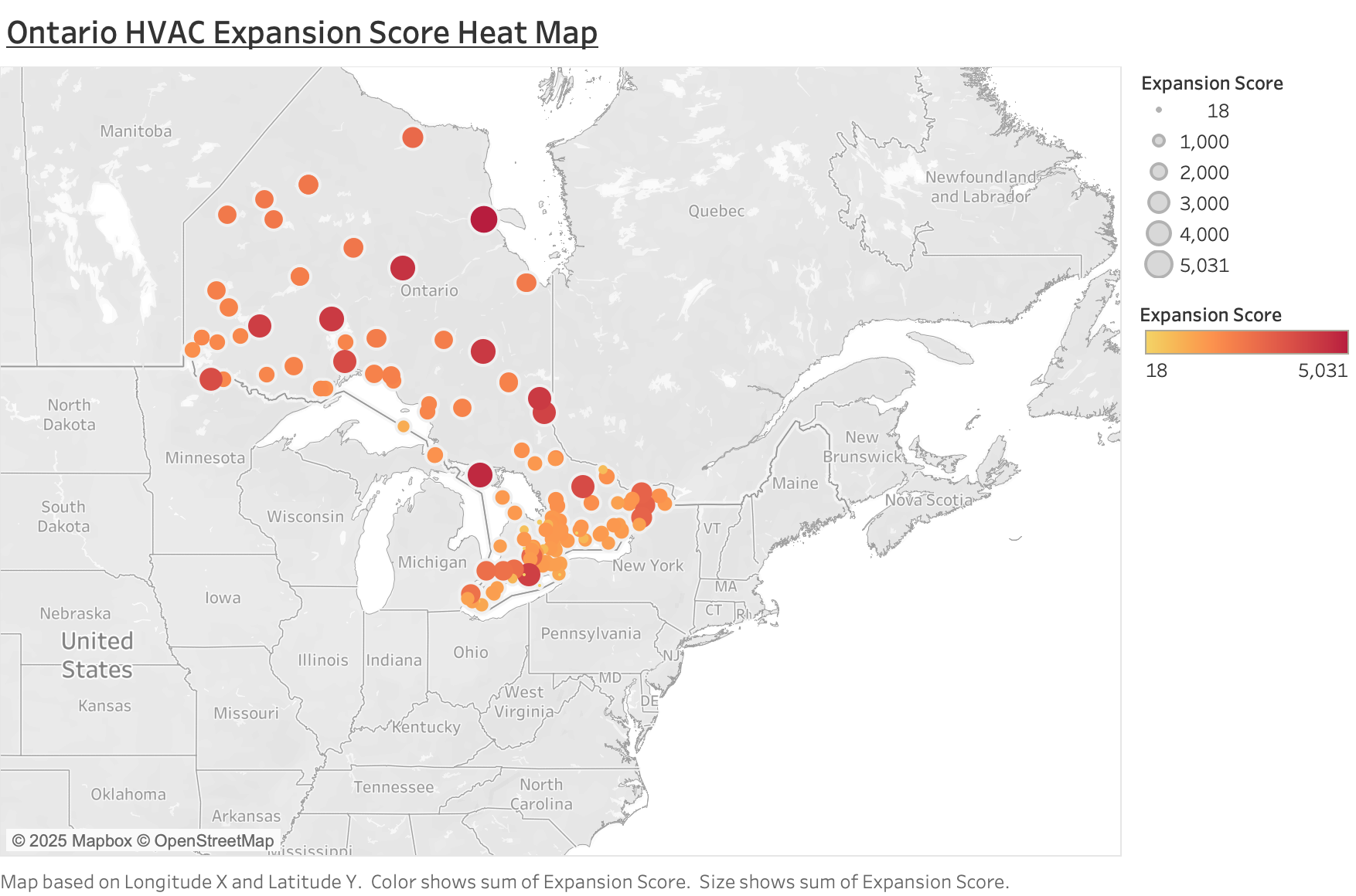
Here is the heat map that shows every weather station on the map and colors each one by its Expansion Score. It shows how climate needs change across Ontario. Northern regions have long and intense heating seasons. Southwestern regions and the Golden Horseshoe have stronger cooling seasons and larger populations.
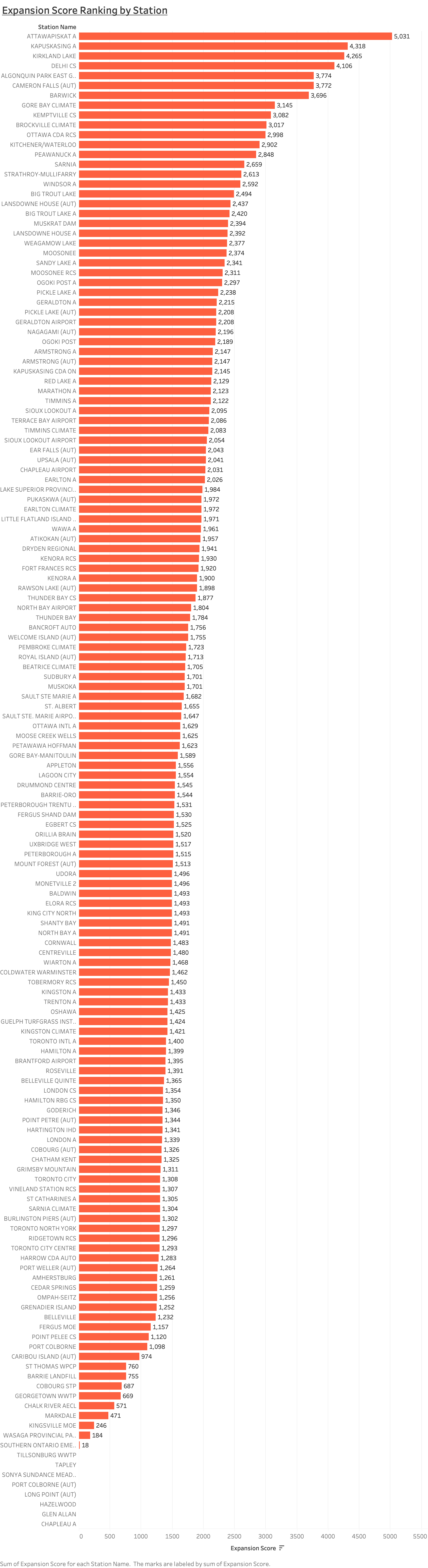
The next visual is a ranking of all the stations from highest to lowest Expansion Score. It shows which regions have the strongest HVAC demand and which ones sit in the middle or near the bottom. It also helps compare cities that might look similar on paper but have very different climate needs.
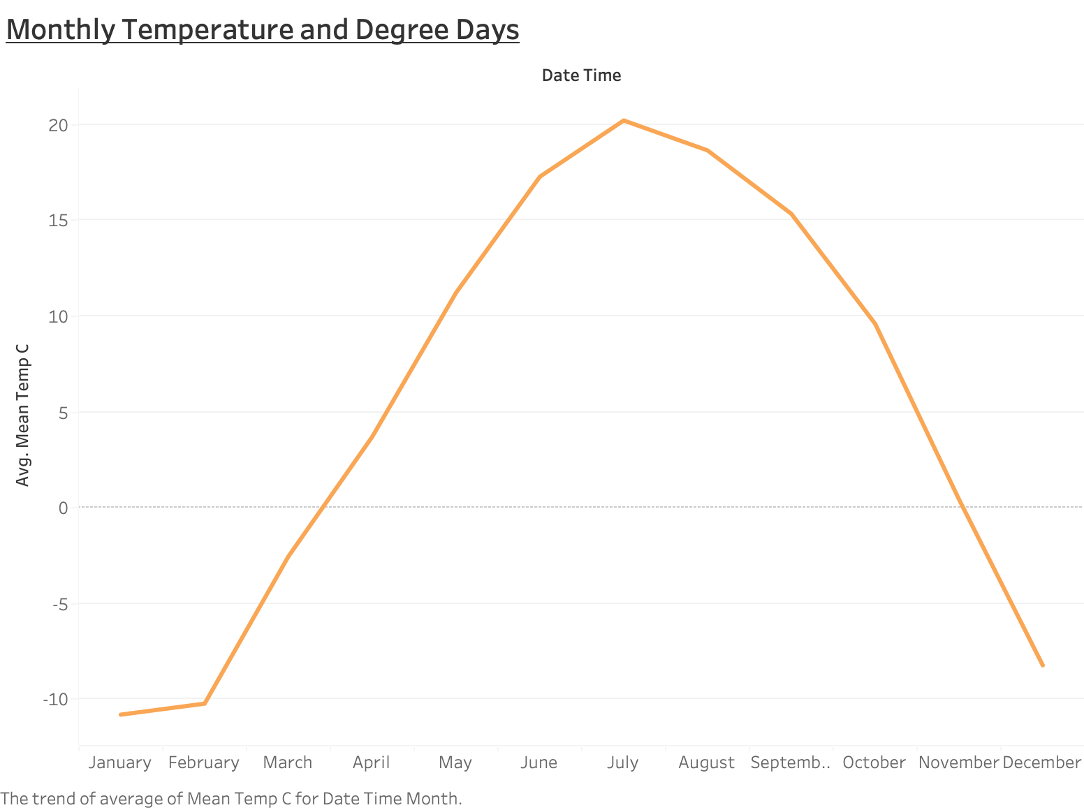
The last main visual is a monthly temperature and degree-day line chart. It shows how fast temperatures change, how long heating and cooling seasons last, and when HVAC teams should expect peak workloads. It also highlights differences between regions with sharp seasonal shifts and those with smoother cycles.
How This Helps with Market Planning
This kind of analysis is helpful for HVAC operators and private equity firms that invest in service businesses. Climate is one of the strongest long-term drivers of HVAC work. When you understand it at a regional level, you can make better decisions about where to expand, how to plan technician staffing, and which markets have the best long-term fundamentals.
When looking at acquisitions or planning new branches, firms can use real climate metrics instead of relying on intuition. Places with strong heating or cooling loads often have steadier revenue, less seasonality, and more recurring maintenance work. By showing exactly which regions have these loads, this project gives a useful starting point for market sizing and planning.
What I Learned
This project helped me grow my skills in data engineering, cloud storage, BigQuery SQL, Python, and Tableau. More importantly, it taught me how to take raw environmental data and turn it into something a business team can actually use. Building the entire workflow from data ingestion to modeling to visualization helped me see how technical work can support real strategic decisions. It also showed me the value of turning complex data into a simple story that makes opportunities easier to see.